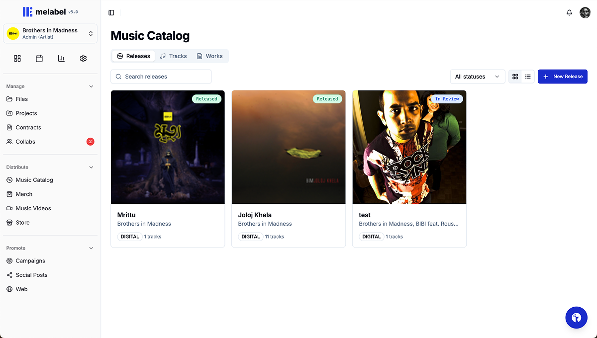
Selected Work · melabel
What happens when the designer is also the one who loses if it's wrong.
These case studies come from building melabel — a music business OS for independent artists and labels. That means every design decision had a direct business consequence and no one above me to absorb the fallout.
melabel is a music business OS that touches distribution, analytics, contracts, finance, project management, and AI automation — all for independent artists and labels. These case studies document the hardest design problems I encountered building it.
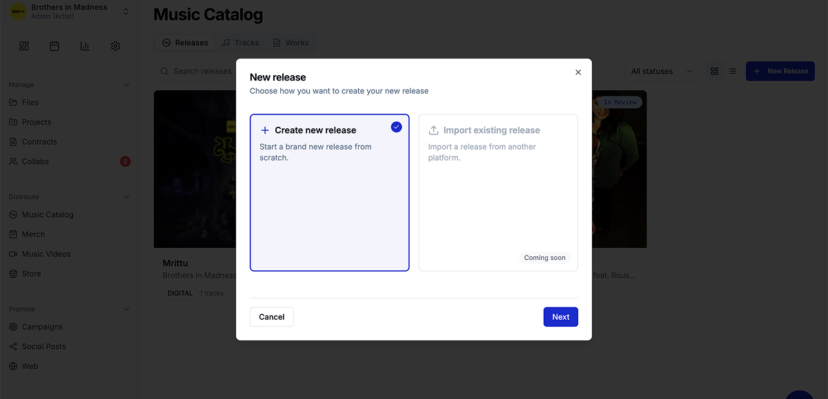
The form that needed to be 47 fields — and had to feel like 8
Background
melabel uses FUGA as its distribution infrastructure — a professional-grade system that routes releases to 40+ DSPs including Spotify, Apple Music, and Tidal. FUGA's submission requirements are comprehensive: release-level metadata, per-track metadata, contributor roles, rights information, pricing tiers, catalog numbers, UPC codes, and more.
The brief I set myself: build a release submission flow that is complete enough to pass FUGA validation on every submission, and simple enough that an artist releasing their first song doesn't feel like they're filing a tax return. Those two requirements are genuinely in tension. That tension is the design problem.
The real problem
Early in the build, I made a mistake that most tools in this space also make: I started by mapping the FUGA field requirements and designing a form around them. The result was technically correct and emotionally brutal.
The insight that changed everything came from watching five artists attempt the submission in early testing. Not one of them abandoned the form because the fields were hard to understand. They abandoned it because of the fields they couldn't answer — publisher name, catalog number, pricing tier, label name. Questions that assumed a business infrastructure most independent artists don't have.
“I don't have a label name. Do I need a label? Is this not for me?”
The solution: a two-layer field model
I categorised every FUGA-required field into two buckets: fields that artists understand and need to provide themselves, and fields that exist for technical or rights infrastructure that can either be handled administratively or inferred from defaults.
| Field | Required by FUGA | Shown to artist | Rationale |
|---|---|---|---|
| Release title | Yes | ✓ Visible | Artist knows this. Essential. |
| Artist name(s) | Yes | ✓ Visible | Core identity field. |
| Release date | Yes | ✓ Visible | Artist controls this. |
| Primary genre | Yes | ✓ Visible | Artist knows their genre. |
| Track audio file | Yes | ✓ Visible | Artist has the file. |
| Track title | Yes | ✓ Visible | Artist names their tracks. |
| Audio language | Yes | ✓ Visible | Simple, artist knows this. |
| Contributor roles | Yes | ✓ Visible | Artist knows who made it. |
| Original release date | Conditional | ✓ Conditional | Only shown for re-releases. |
| UPC / Catalog number | Yes | ✗ Admin layer | Generated/assigned by admin. |
| Label name | Yes | ✗ Admin layer | Defaults to melabel or artist name. |
| Publisher | Yes | ✗ Admin layer | Defaults unless PRO-registered. |
| Price tier | Yes | ✗ Admin layer | Standard tier by default. |
| Copyright line | Yes | ✗ Admin layer | Auto-generated from artist + year. |
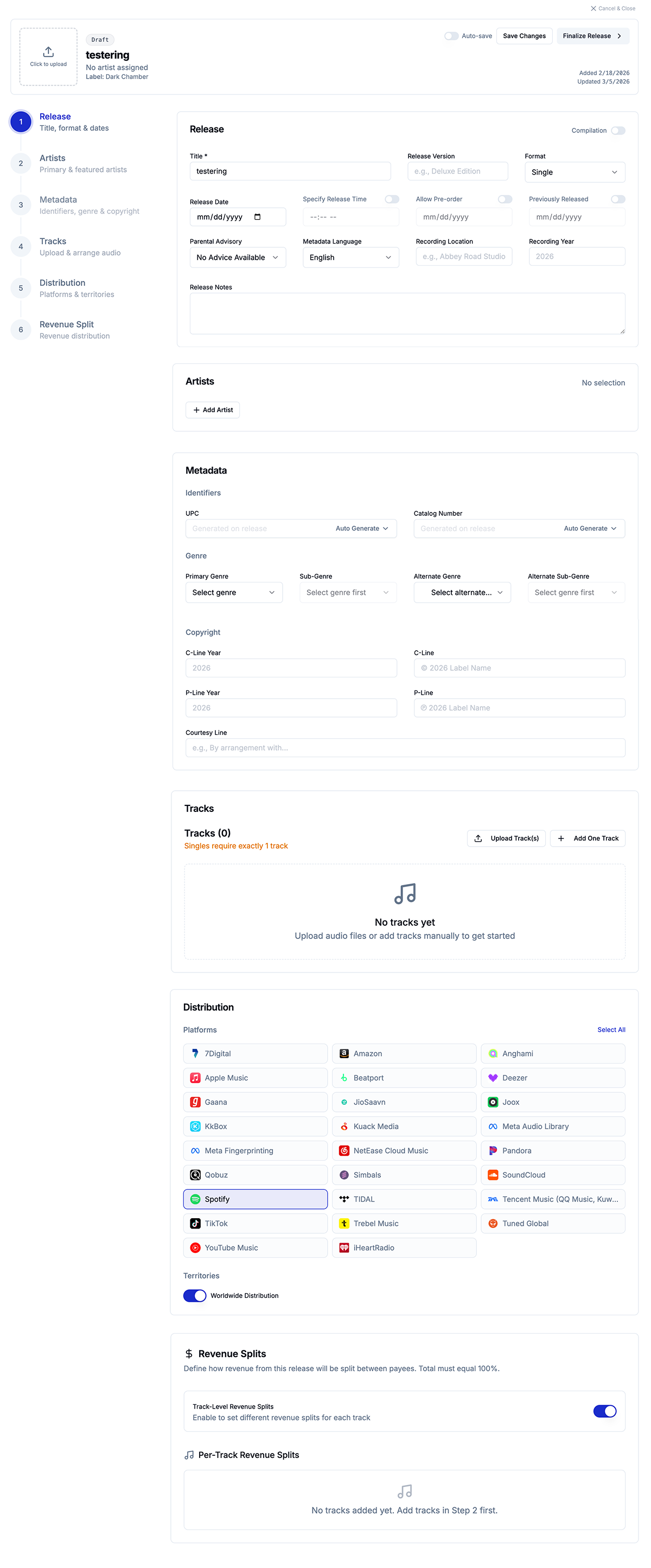
The result: the artist-facing submission flow contains 8 required fields, 1 conditional field, and contributor roles — a flow that takes under 4 minutes to complete for a standard single. Zero FUGA submission fields were removed or skipped. The system is complete. The experience is simple. Those two things coexist because they live in different layers.
What I cut, and what I kept conditional
The hardest field was Original Release Date — required by FUGA for catalogue releases but irrelevant for new releases. The solution was conditional rendering based on a single upstream question: “Is this a new release or a re-release of existing music?” One binary question surfaces or hides the field entirely.
This became the template for every edge case in the flow. Rather than designing for the average user and leaving edge cases broken, the pattern was: one upstream question that shapes what follows.
Outcomes
Before the two-layer model, the most common support question was some variation of “what is a catalog number / what do I put for label name.” After launch those questions dropped to near zero.
Streams are a number. Decisions require meaning.
Background
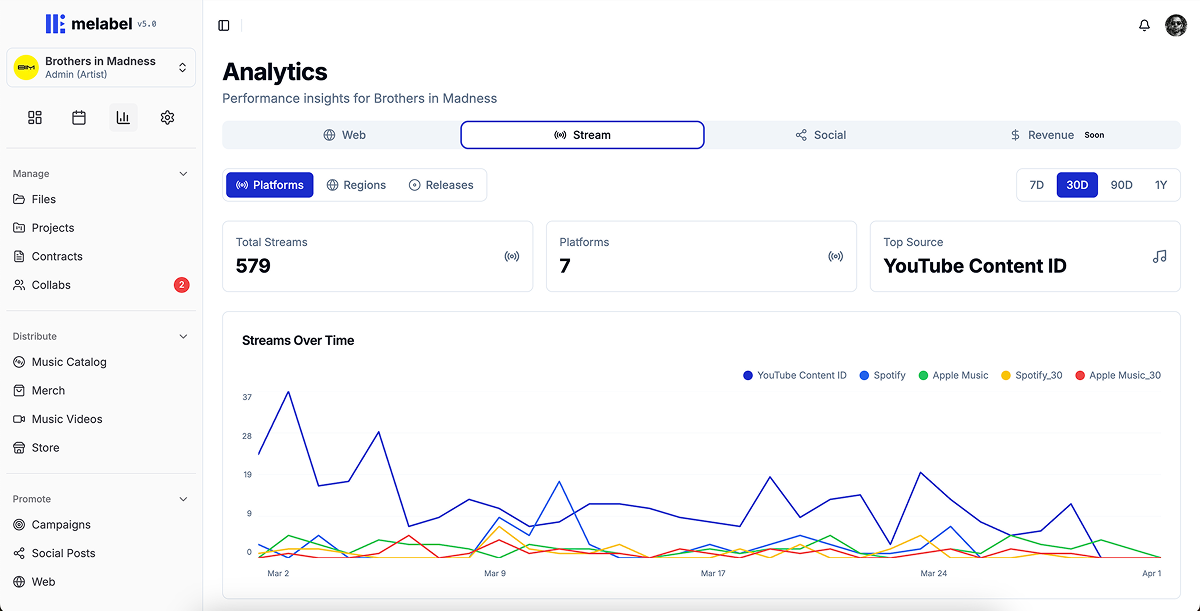
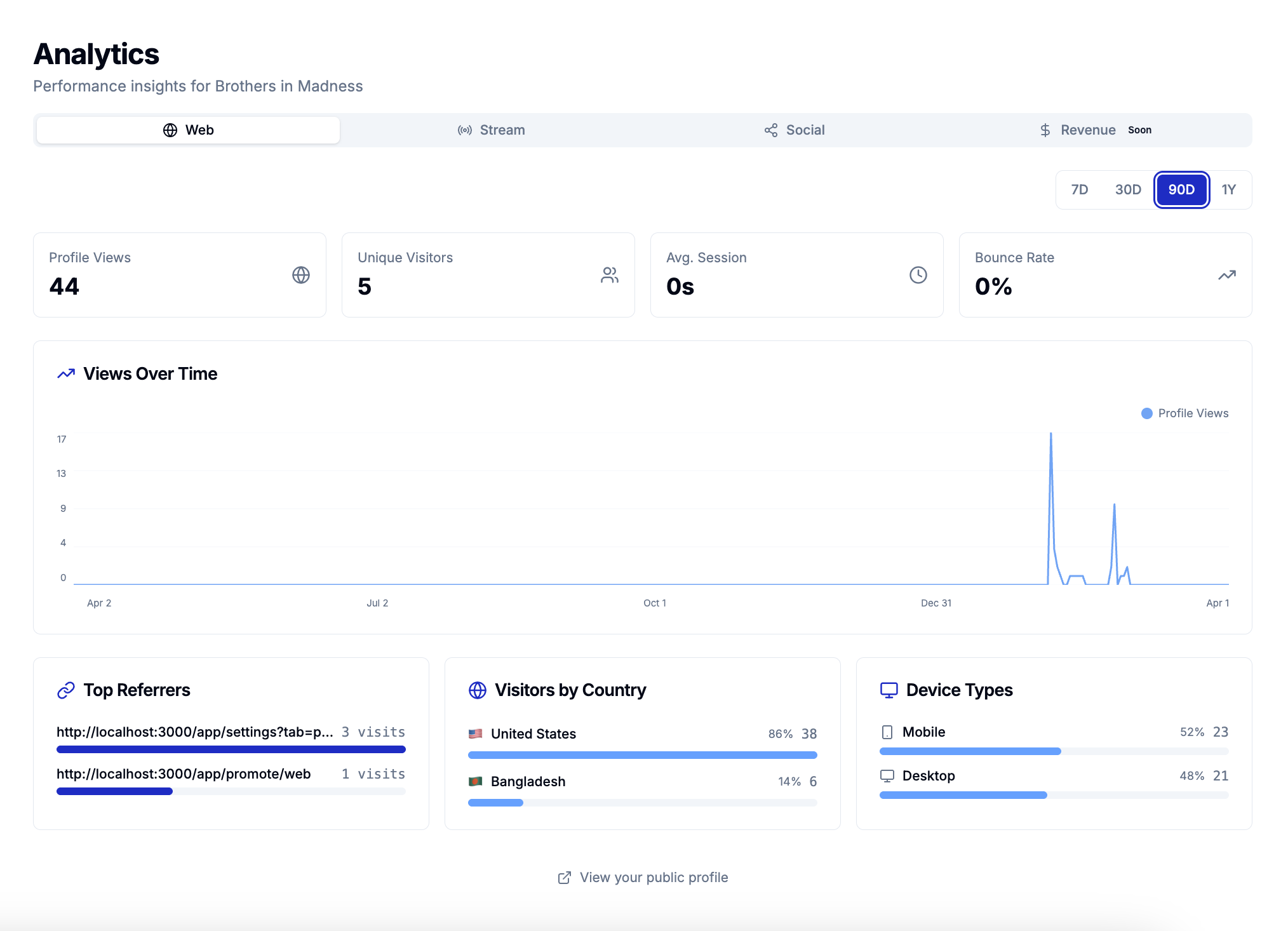
melabel aggregates streaming data across 40+ DSPs into a single analytics layer. When I designed the first version, I showed everything — total streams, per-platform breakdown, daily trend lines, top tracks, territories, demographics. A comprehensive data picture.
More data was making artists feel worse, not more informed. They would check the dashboard, see a stream count that meant nothing in isolation, feel vaguely anxious, and close the tab without taking any action.
The real problem
I ran structured interviews with 14 artists. The question was: “Tell me the last time you looked at your analytics and did something differently because of what you saw.”
Eight of 14 couldn't recall a single instance. The other six described making decisions based on three signals: which platform was growing fastest, which territory was showing unexpected traction, and how a recent release had performed in its first 7 days. Everything else they looked at but didn't act on.
“I check my streams every morning like I'm checking my weight. It doesn't help me do anything. It just makes me feel things.”
Three decisions that restructured the analytics experience
What I deliberately chose not to show
I removed skip rate and save rate from the primary artist-facing dashboard, even though melabel has access to both signals. Skip rate for an independent artist in the first two years of their career is a metric that causes spiralling and doesn't point toward an action. I tested including it with 8 artists over 4 weeks. Six of eight described it negatively. Zero described changing anything because of it.
It stays in the data layer — accessible in detail views for artists who want it — but it doesn't lead.
Outcomes
A dashboard that gets opened and closed without producing action is a well-designed anxiety machine. The 3.1× action event increase was the signal that the redesign was actually working.
Designing one product for two users who want opposite things
Background
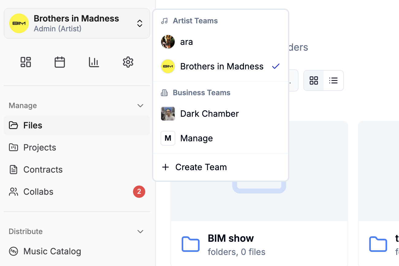
melabel serves two distinct customer types on the same platform: independent artists (B2C) and independent labels (B2B). When I launched, these two groups had access to fundamentally the same interface. That was the mistake.
The same navigation, the same dashboard, the same information hierarchy served neither well.
The real problem
I initially assumed this was a permissions problem. It wasn't. The entire mental model of the product was different for each user type. An artist thinks in releases. A label manager thinks in rosters. These aren't the same product with different permissions. They're different products with shared infrastructure.
“When I log in I feel like I'm looking at someone else's product. I can tell it wasn't built for me — I have to find my way around it every time.”
Two entry points, shared infrastructure underneath
The tension I didn't fully resolve
The hardest ongoing problem is features that are simultaneously artist-facing and label-facing but mean different things to each. The financial dashboard is the clearest example: the same data, read from two positions of power, carries different stakes. This remains an active design problem rather than a solved one.
Outcomes
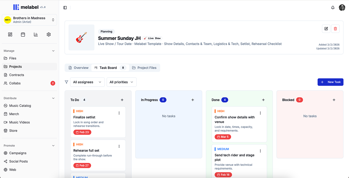
Projects & Files Manager — designing work tools for people who think in songs, not tasks
Background
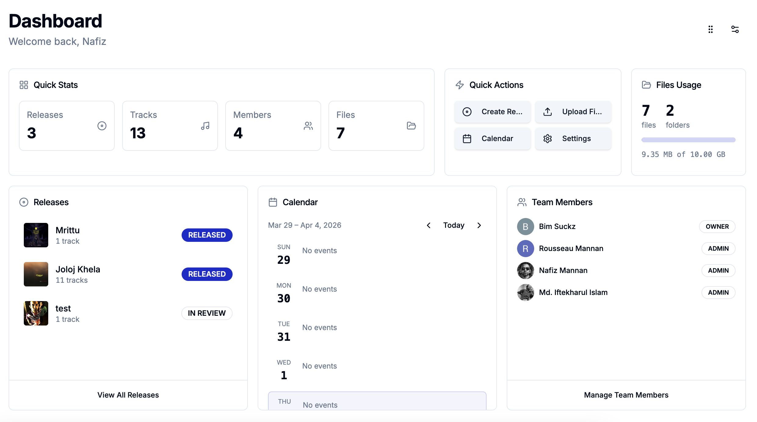
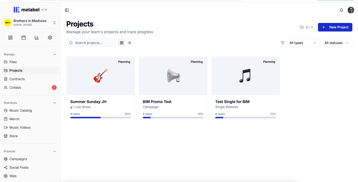
melabel includes a full project management layer — the ability to create a release project, manage tasks across the release cycle, attach and version files at the task level, collaborate with team members, and track progress across multiple concurrent projects.
When I built the first version, I modelled it on standard task management. It was technically complete. Artists opened it once and never came back. Usage data at 30 days showed that 91% of users who created a project had not returned to it after the initial setup.
Understanding why V1 failed
I ran 11 interviews with artists who had created a project and abandoned it:
“I made one project, stared at it, didn't know what to do with it, and went back to my Notes app and a group chat.”
Creative work is not linear — and the task model assumed it was
Standard project management assumes a workflow that moves forward: To Do → In Progress → Done. Music production doesn't work that way. A song can be “mixed,” then need to go back to recording. The forward-only status model was the wrong shape for the work.
I replaced the linear status model with one built around the actual states creative work moves through — including backwards movement and parallel states: Not started, Active, Waiting on someone, Ready, Parked, and Needs revision.
“Parked” for work deliberately deferred without being abandoned. “Waiting on someone” to distinguish between active and blocked work. “Needs revision” to handle backwards movement that standard models pretend doesn't exist.
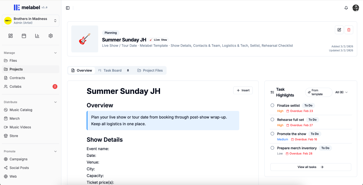
Templates as domain knowledge, not just structure
Working with 6 artists, I mapped out what a release project actually contains when it goes smoothly. The resulting template was an embedded release playbook with pre-populated tasks, suggested sequencing, timing guidance, and placeholder file slots at each stage.
The template reduced time-to-first-task from 8.4 minutes to under 60 seconds.
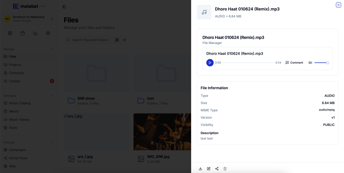
Files in context, not files in folders
V1 treated files as attachments — a flat list appended to tasks. I reframed the design question from “Where do files live?” to “What does someone need to know about a file to use it confidently?”
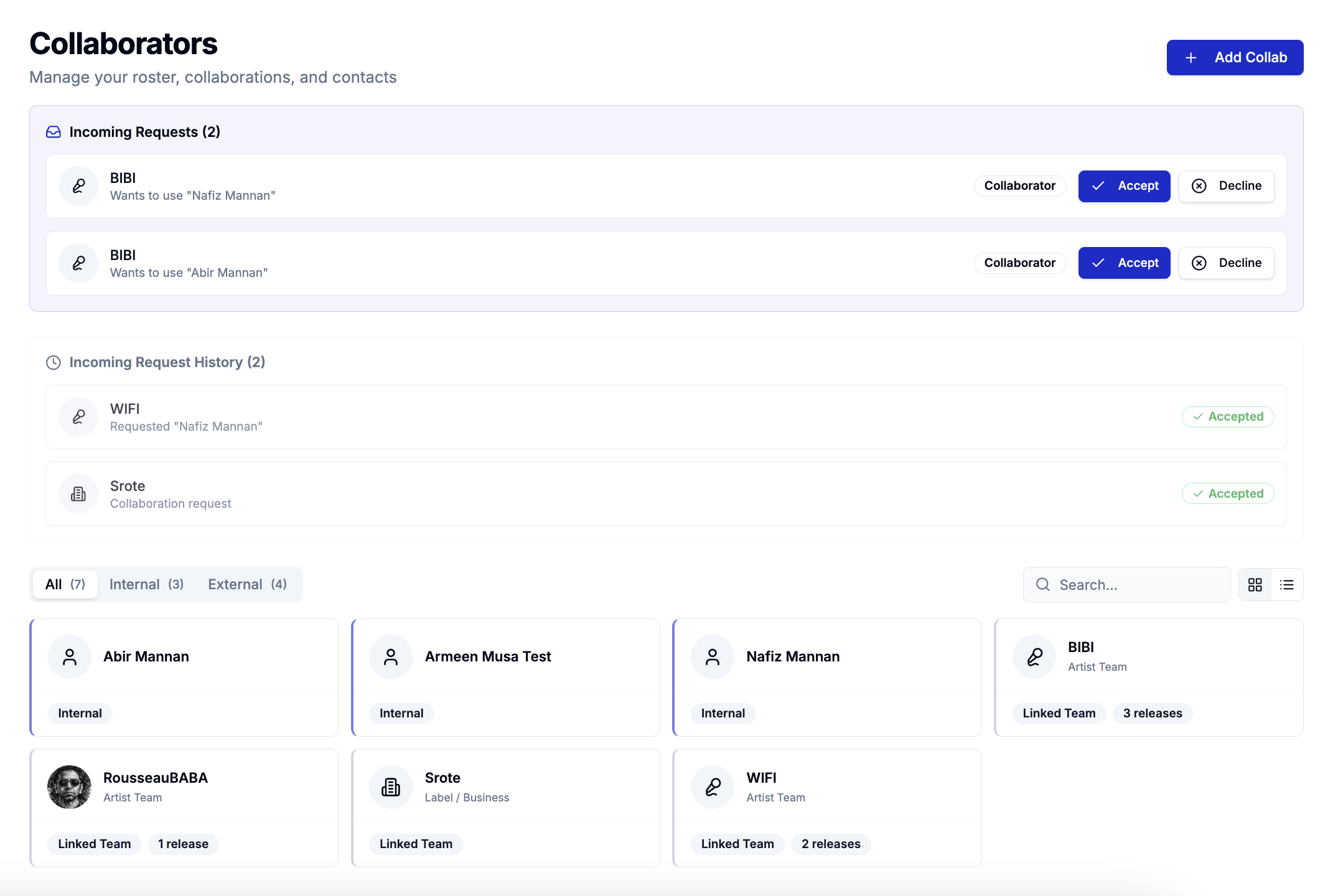
Making label oversight feel like support, not surveillance
Artists described feeling watched. The solution was separating two distinct viewing modes:
The critical decision was removing the completion percentage from the artist-facing project view. I replaced it with a milestone proximity indicator — “your next milestone is Mix Approval, 5 tasks away.” This communicates progress without implying a deficit.
Outcomes
The metric I track most closely is whether artists are using the promo phase — the tasks that exist after the release is live. The 3.4× increase in promo phase completion is the signal that the project structure is working as a system, not just as a task list.
melabel is live at melabel.io — explore the product the design work behind this case study helped build.